Defa Cloudcharge

Making shared charging infrastructure manageable
Project type
Design System
Year
2021
Client
Club
My role
Design Director / Senior Designer
DEFA delivers EV charging infrastructure across homes, workplaces, and fleets. CloudCharge is the platform that makes that infrastructure usable. The challenge wasn’t to build an app. It was to make a complex, shared system understandable, controllable, and trustworthy.
My role
Worked from the earliest stage of the product
Collaborated closely with CEO, product leadership, and owner Didrik Eidsvig
Defined structure, flows, and interaction model
Led UX, UI, and the product’s visual identity
Problem
Charging infrastructure is complex.
Distributed across locations
Used by different types of users
Limited visibility and control
Often shared between multiple people
Most solutions focus on functionality.
Not clarity.
Insight
Users don’t think in systems.
They think in situations:
Can I charge here?
Is it available?
What is happening right now?
Who else is using it?
And increasingly, those situations are shared.
Clarity creates trust.
Reframing
We designed the app.
But the real goal was to make a complex, shared infrastructure understandable and manageable.
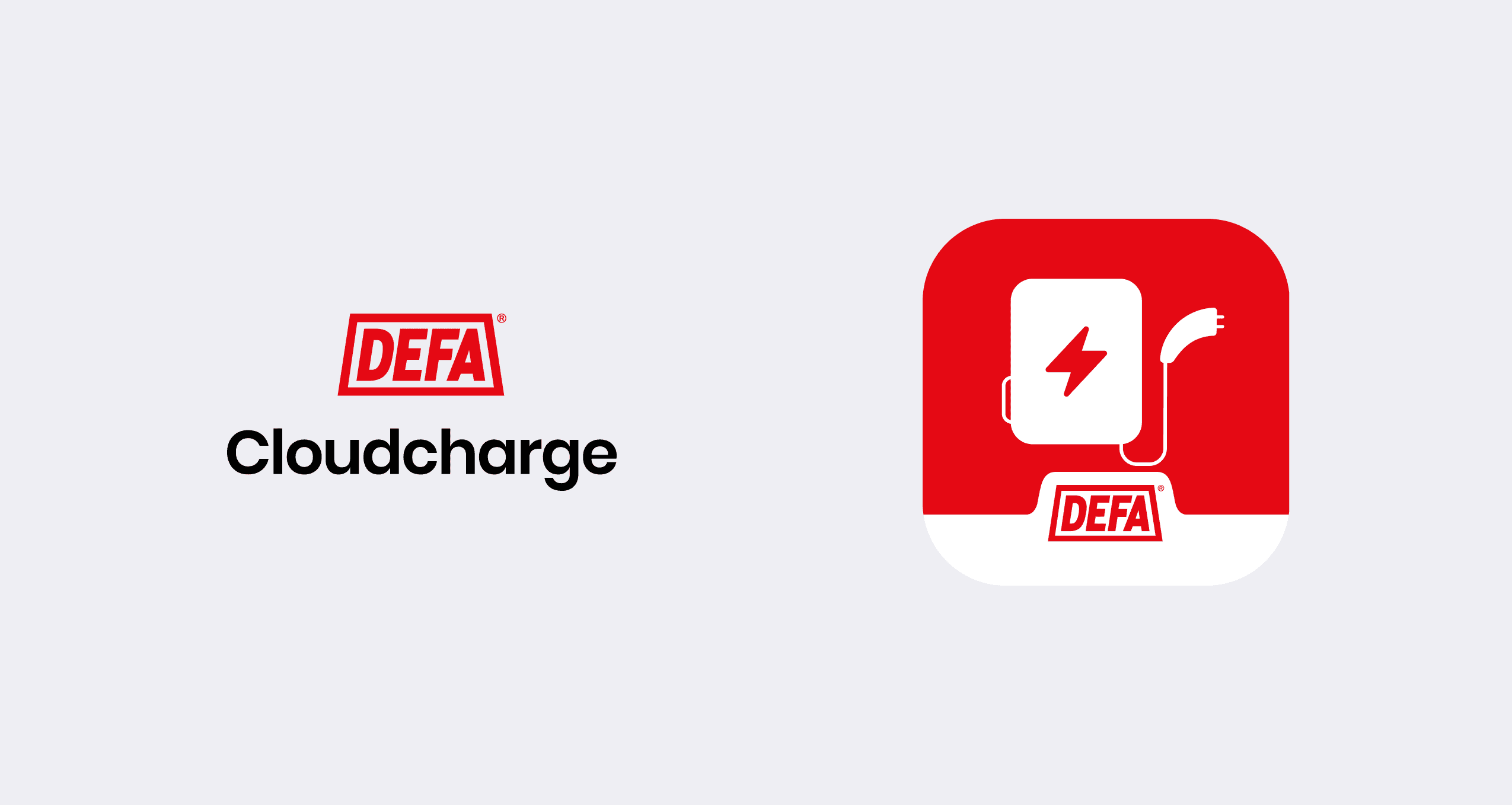
Product Identity
The app needed to feel like part of DEFA’s ecosystem.
Not just a standalone product.
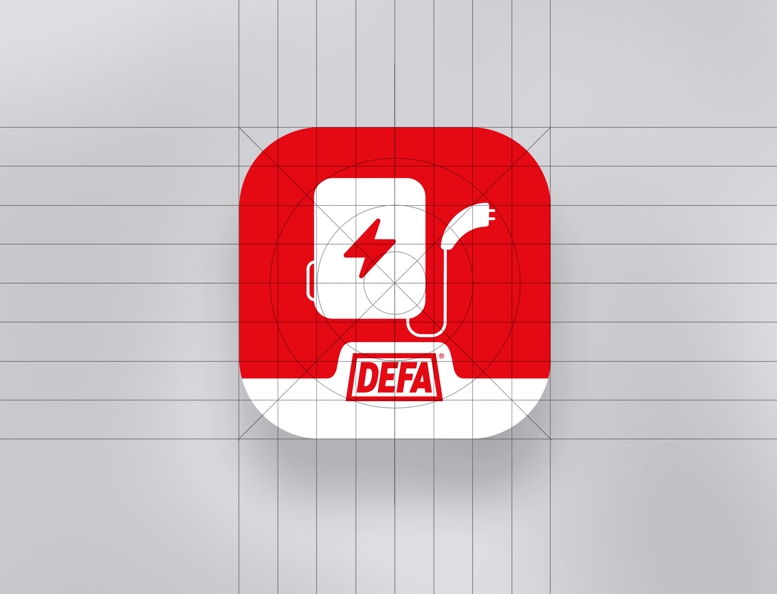
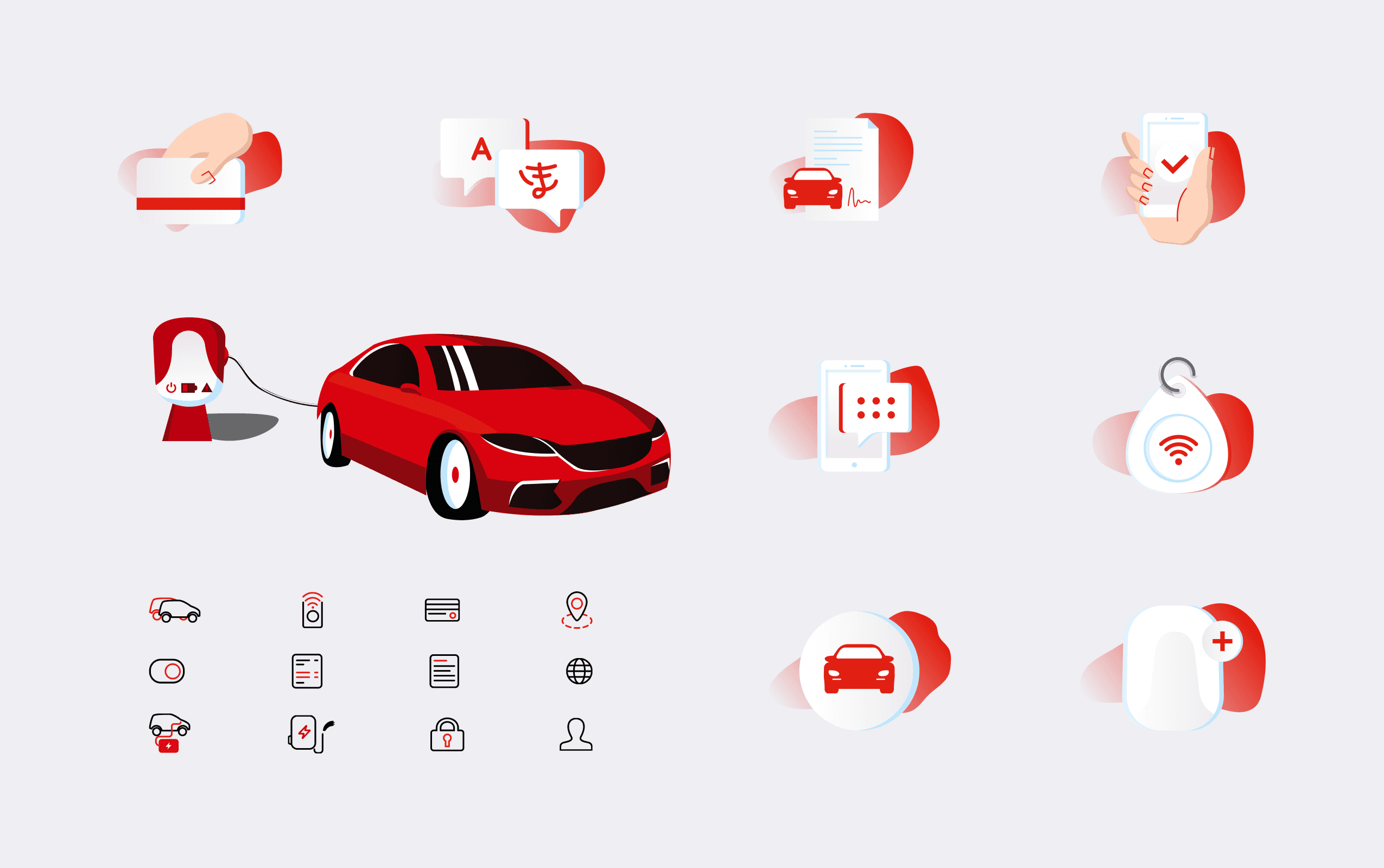
We designed the app icon as part of a larger system — structured to scale across future DEFA products.
At the same time, we developed a custom icon set aligned with DEFA’s charging universe.
The icons are simple, precise, and consistent.
They blend into the product while reinforcing a recognizable visual language.
Not decoration.
A system.

System Design
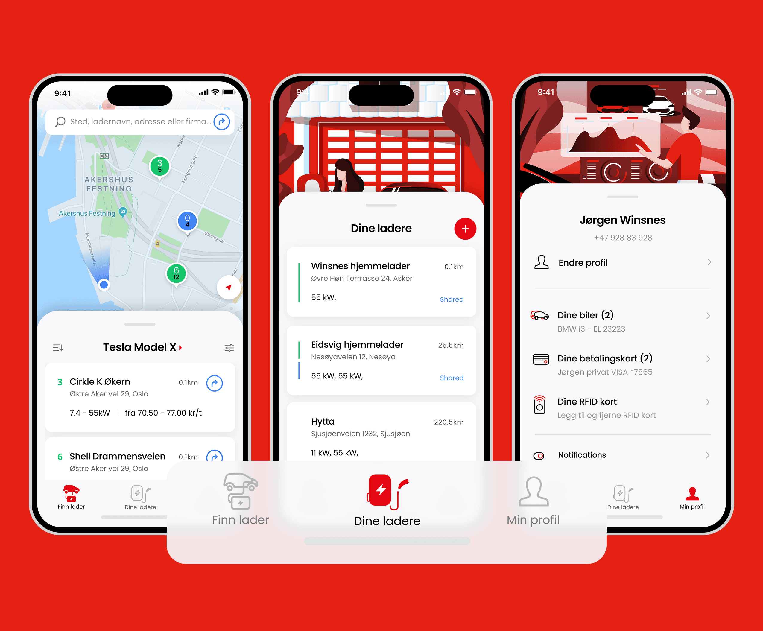
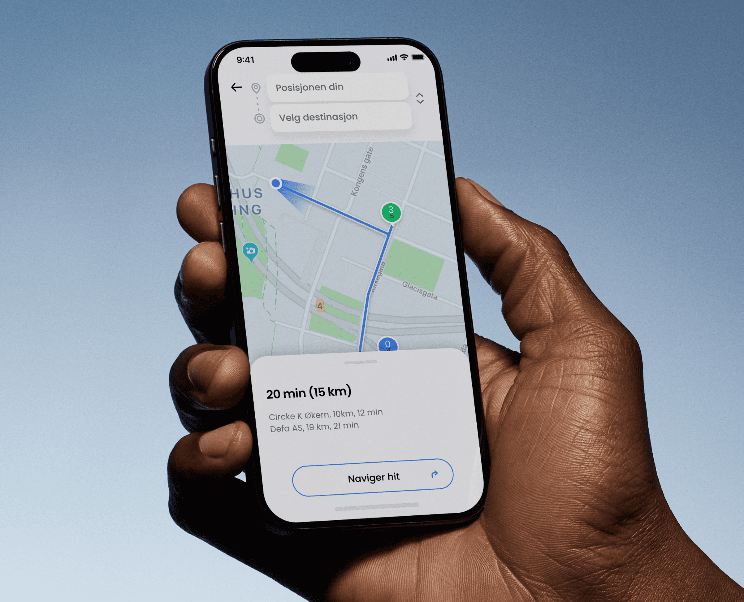
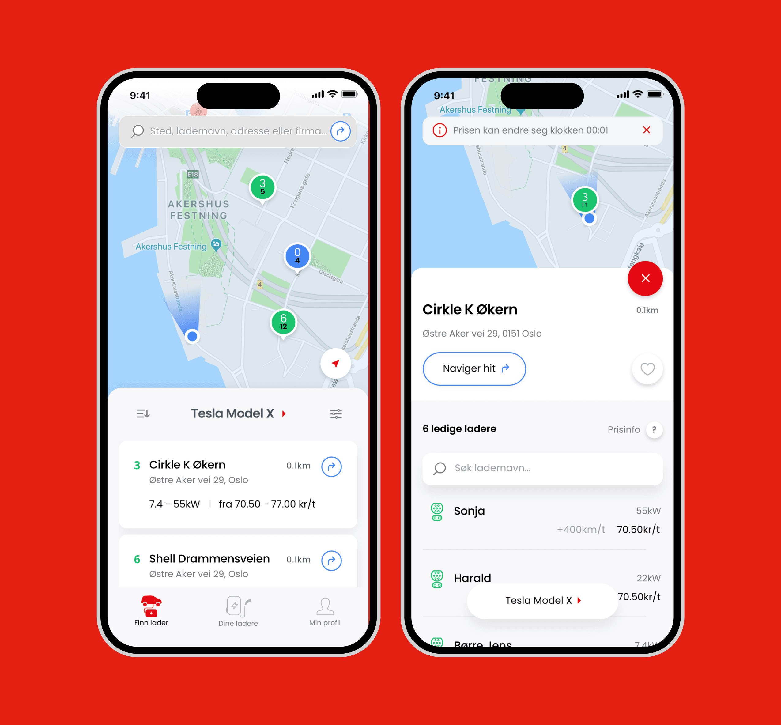
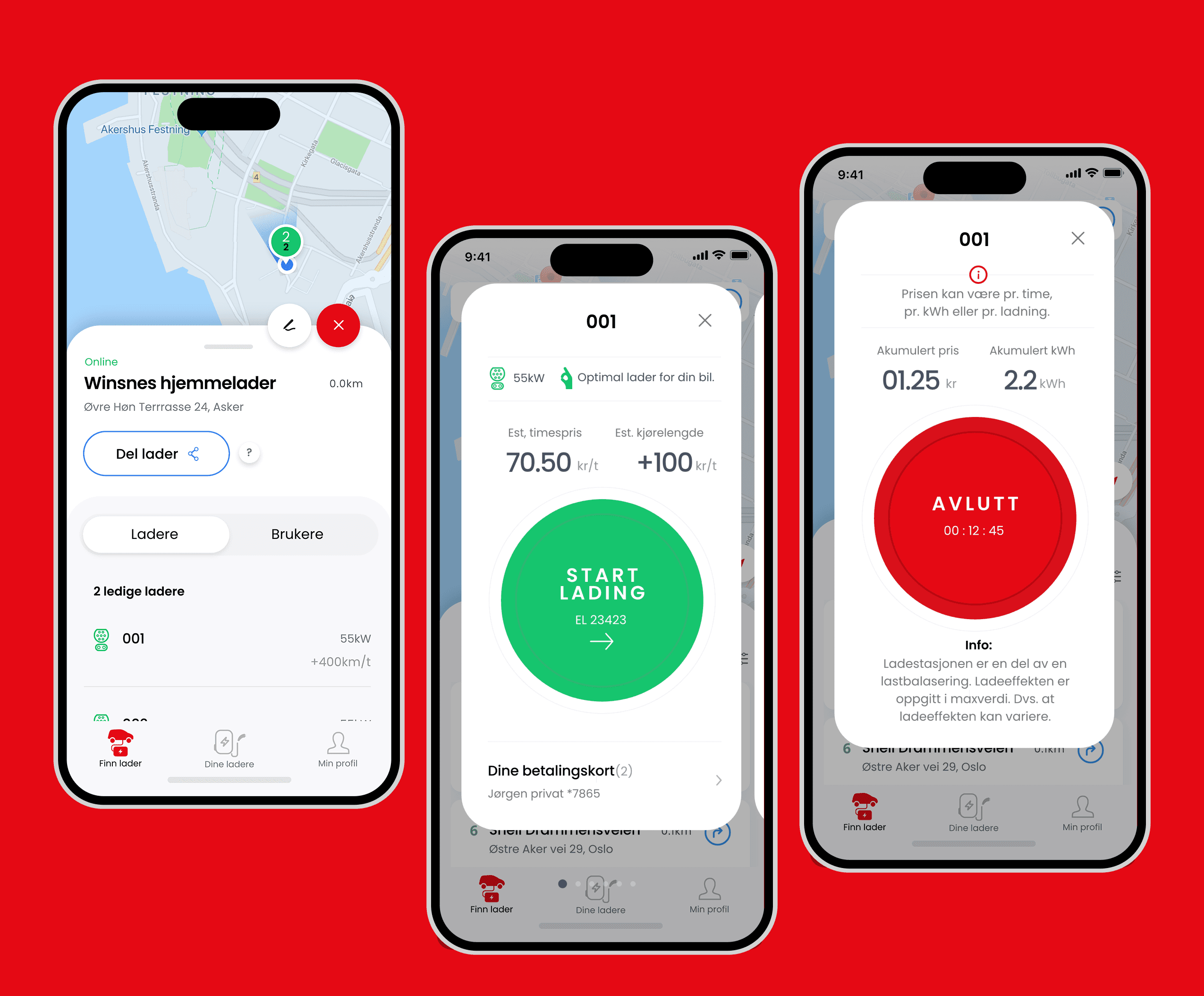
The product is built around three core functions:
Orientation → where can I charge?
Status → what is happening?
Control → what can I do?
This structure works across:
home
workplace
shared environments
Everything else is secondary.

Shared Infrastructure
Charging is not individual.
It’s shared.
Across homes, workplaces, and communities.
The product makes access and control clear:
who can use what, when, and how.
Without this, the system breaks.


Product Expression
The product needed to feel like DEFA.
Not through branding.
Through behavior.
We created a visual system that is:
Light
Minimal
Calm
Precise
It should feel simple — even when the system behind it is complex.
You recognize it without needing the logo.
From System to Product
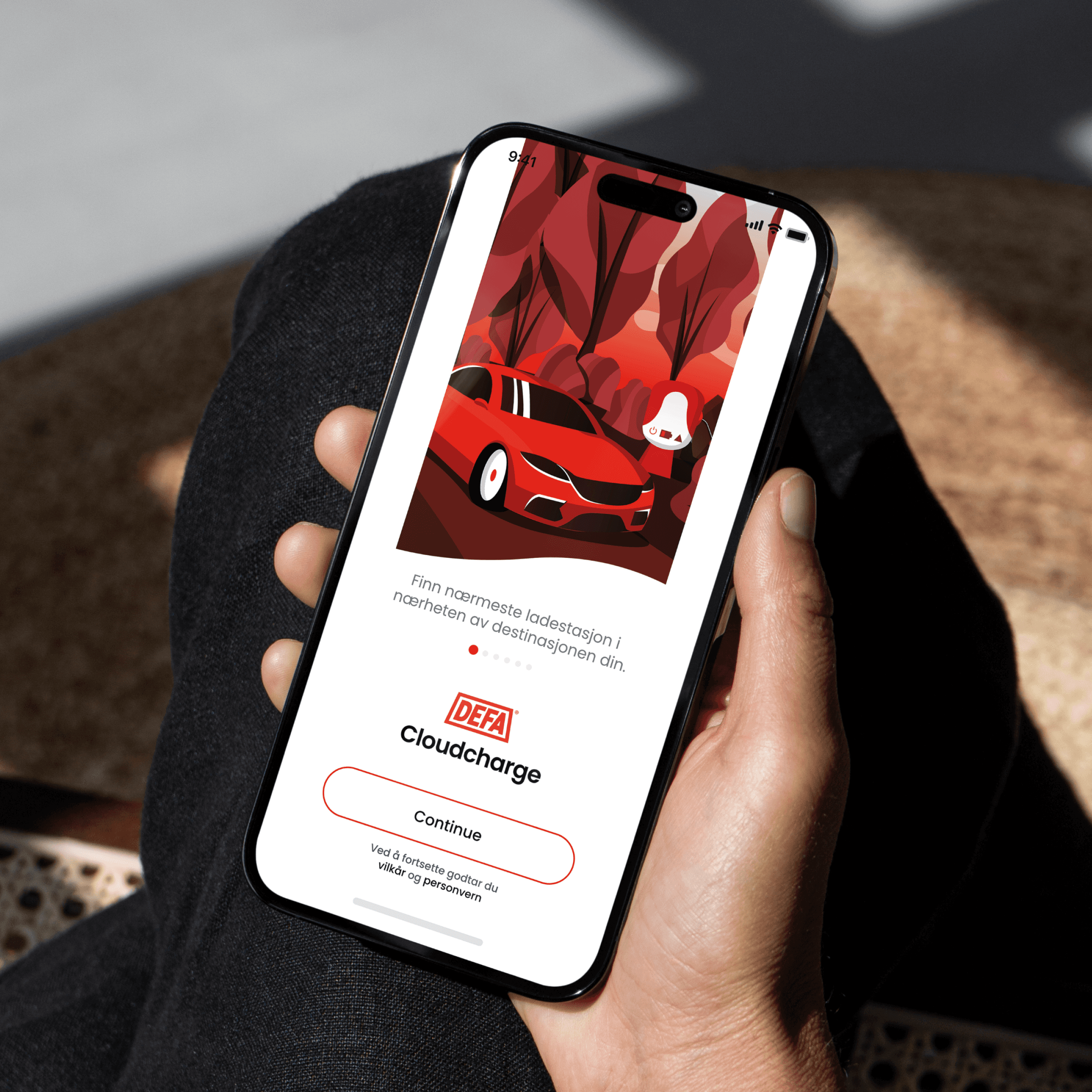
The interface makes infrastructure visible:
Maps create orientation
Status creates transparency
Flows reduce complexity
Controls enable action
The product doesn’t explain the system.
It exposes it.
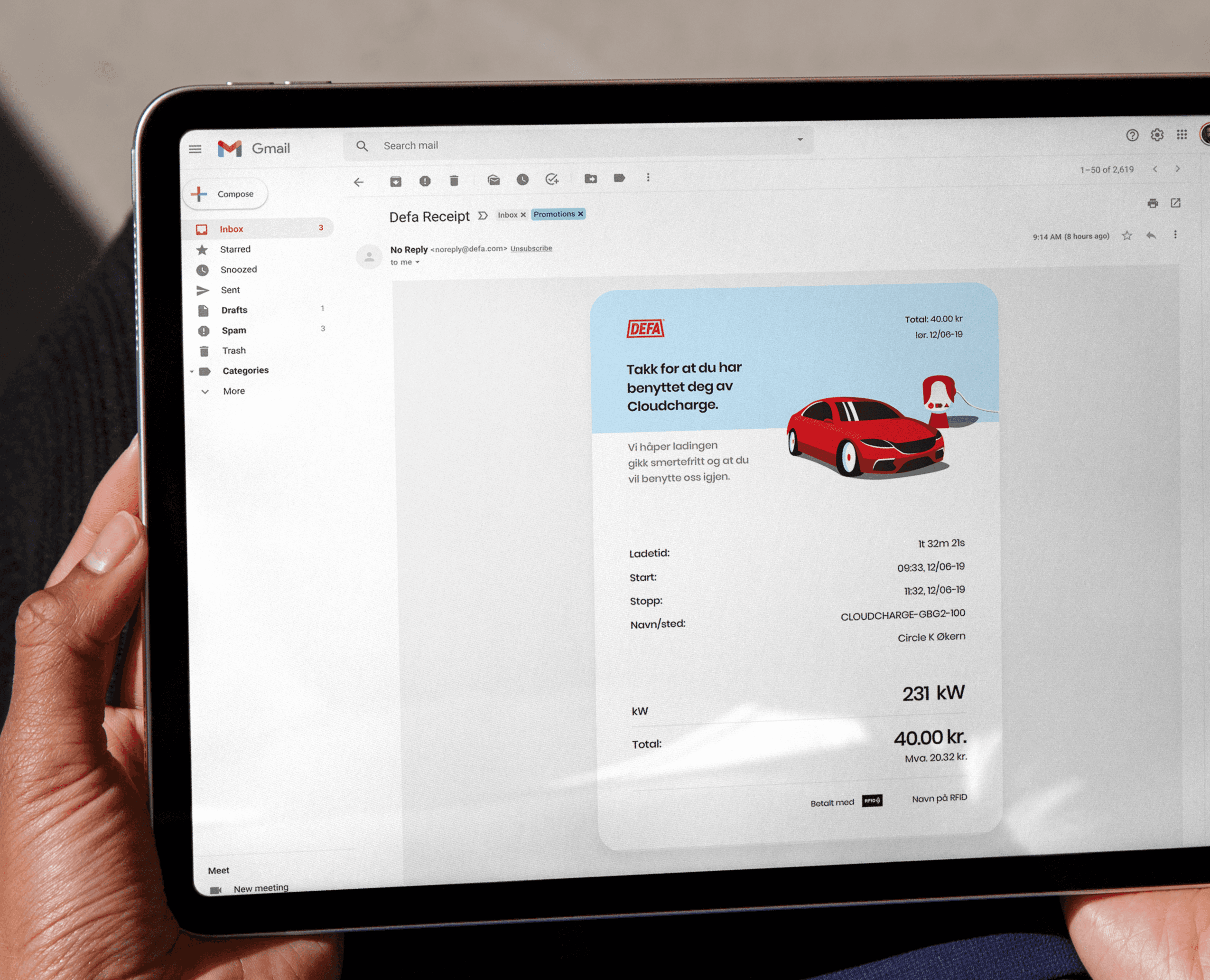
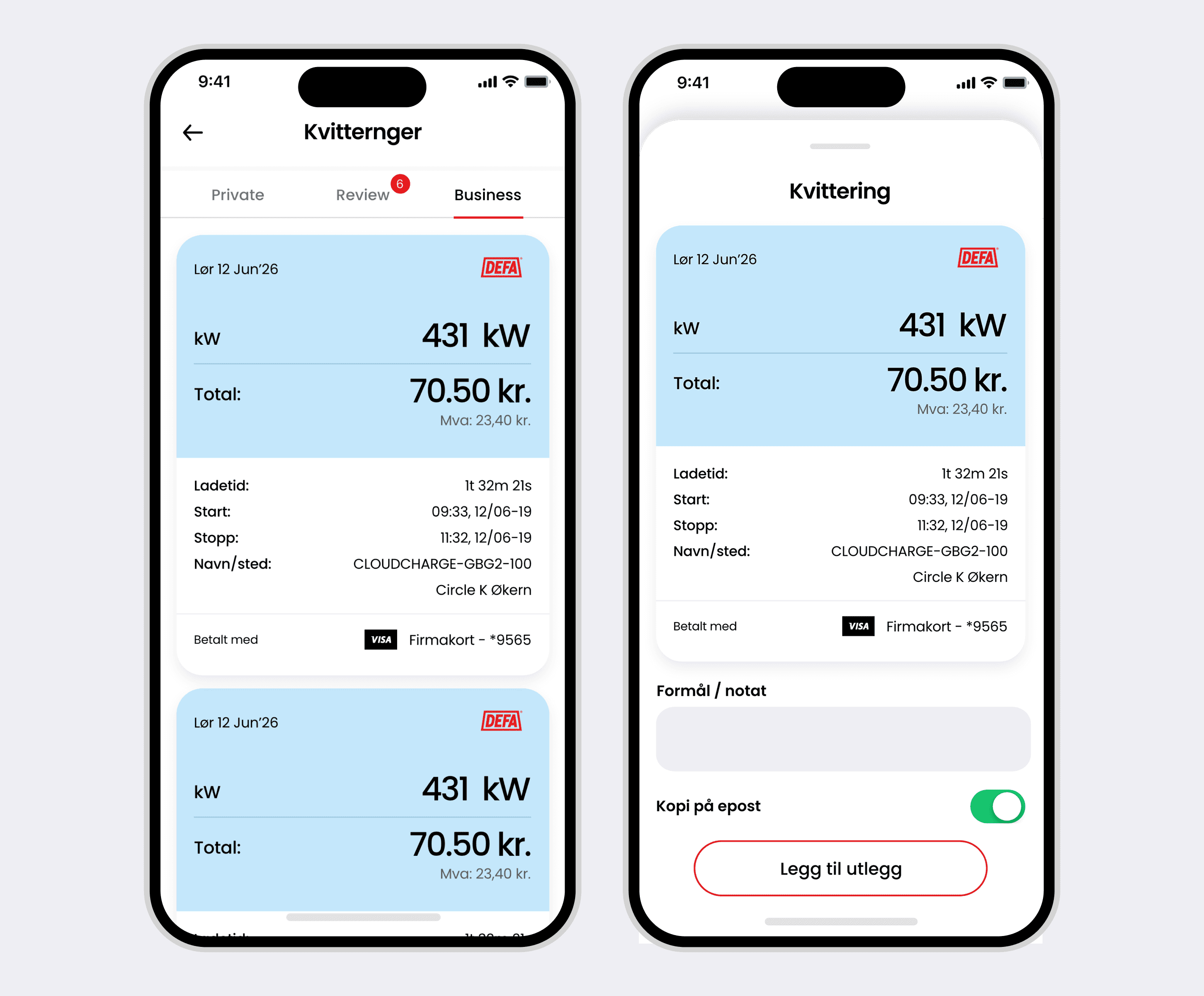
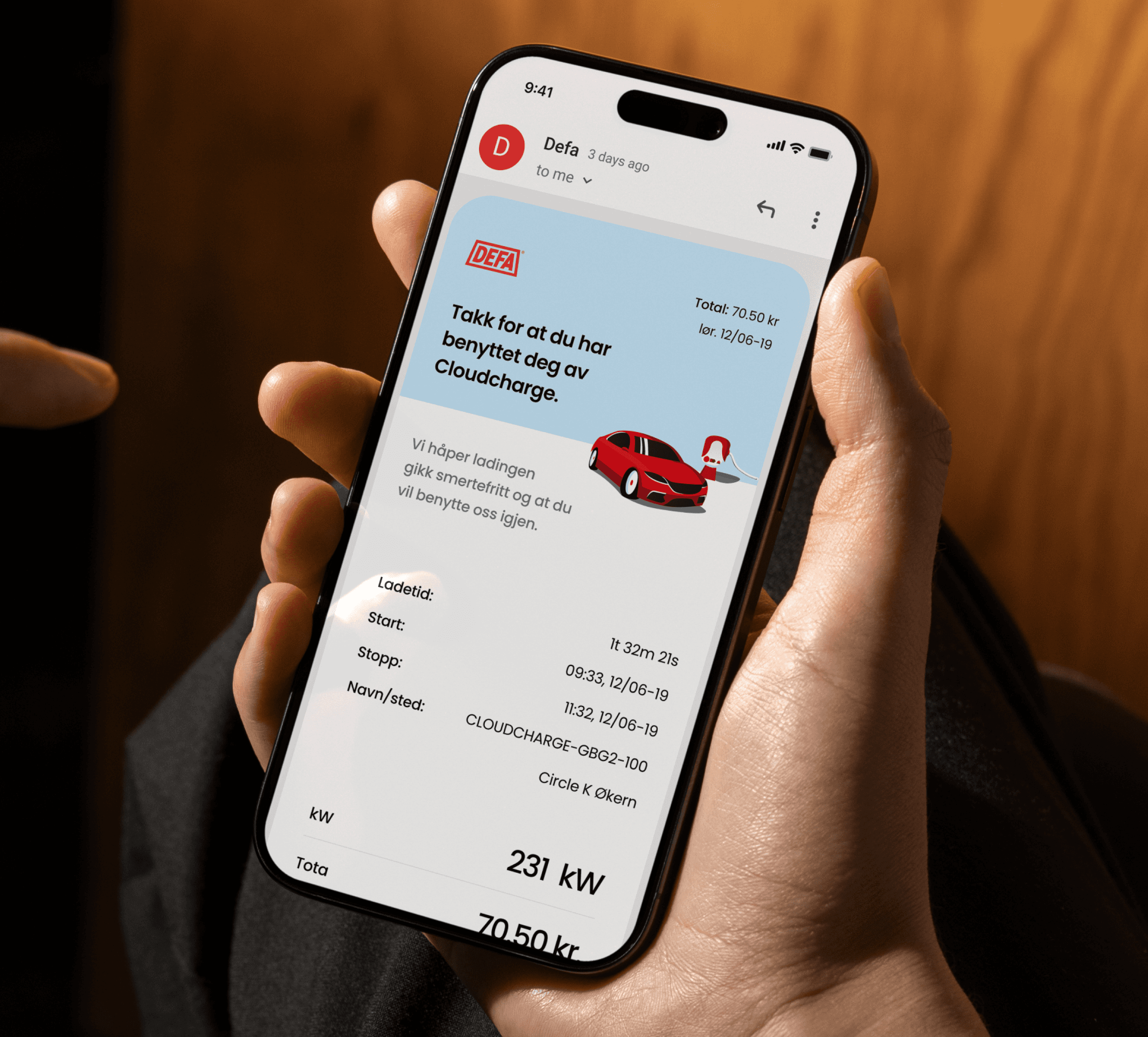
Solution
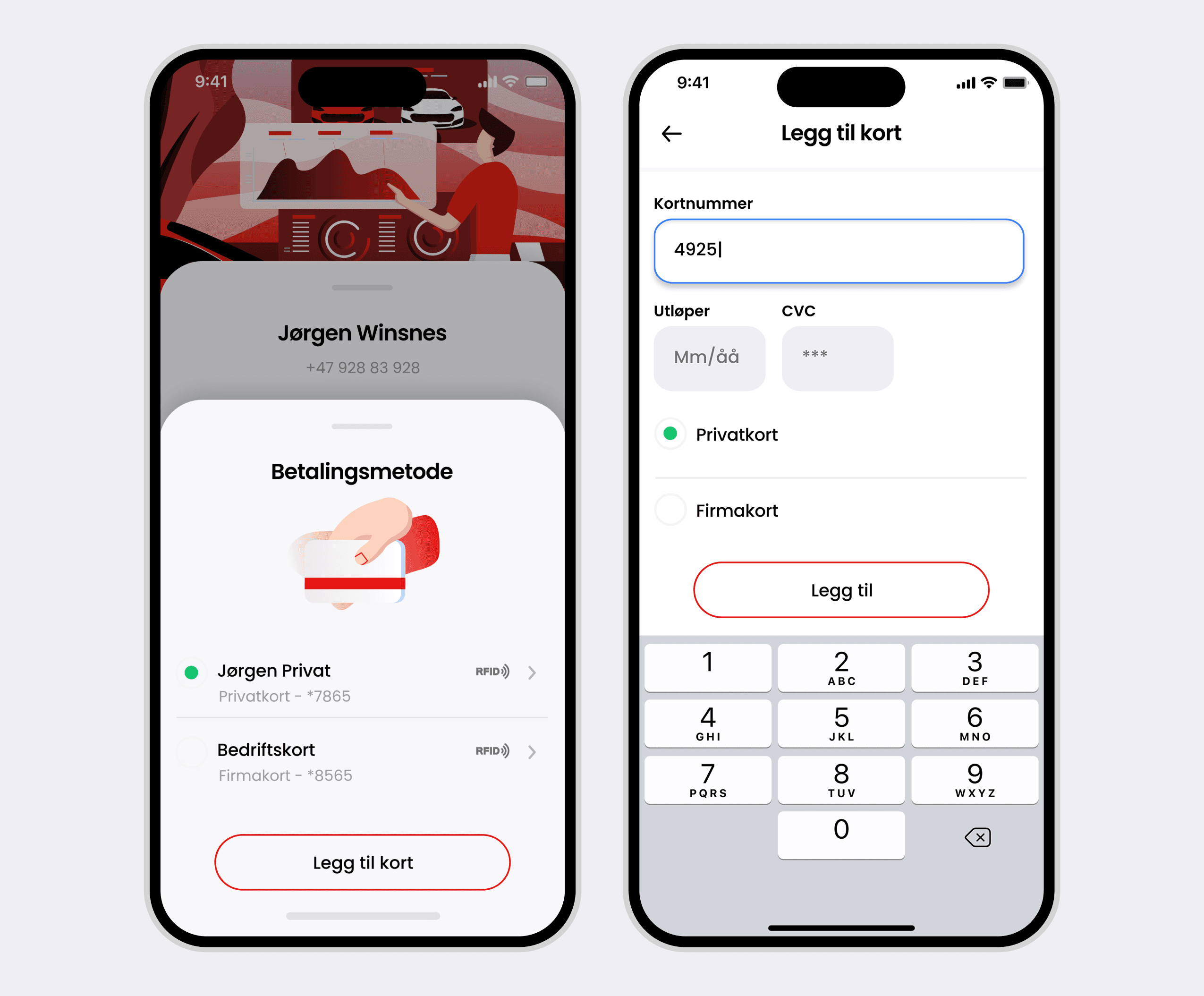
CloudCharge acts as a control layer.
Users can:
find chargers
monitor charging sessions
manage access
understand availability
control usage across environments
The experience is simple.
The system is not.
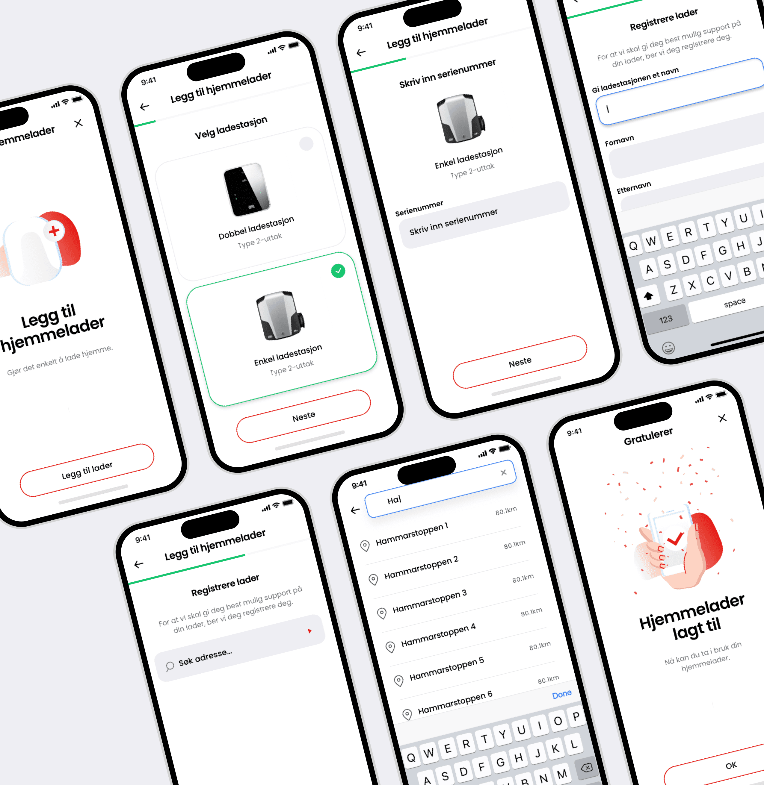
User Experience
Before:
Unclear. Fragmented.
After:
Visible. Controlled.
The experience feels:
Simple
Predictable
Reliable
Impact
The platform makes DEFA’s infrastructure usable.
Improves visibility across locations
Reduces uncertainty in shared environments
Enables multi-user access and control
Creates a consistent experience across contexts
The system becomes something users can understand and act on.
Key Insight
If no one can manage the system, no one can use it.