Nordvik Branding
A brand system for a more modern, technology-driven real estate companyNordvik
Project type
Branding
Year
2018->
Client
Nordvik Eiendomsmegling
My role
Design Director / Senior Designer
When Nordvik split from &Partners, it marked a new direction. More independent. More premium. More technology-driven. The category hadn’t moved. The brand had to.
My Role
I led the conceptual brand direction. Working closely with strategy, I translated positioning into a clear visual system — shaping how the brand looks, behaves, and feels.
From identity and imagery
to motion and application.
Problem
Real estate looks the same.
Dark palettes.
Blue tones.
Safe design.
Built for yesterday.
Insight
If the company moves forward,
the brand has to follow.
Not louder.
Clearer.
Reframing
Instead of designing a brand that fits the category,
we built one that reflects how Nordvik operates.
Structured.
Precise.
Forward-looking.
From familiar → to distinctive.
From category-driven → to system-driven.


System
Built from a grid.
The same structure used to draw homes.
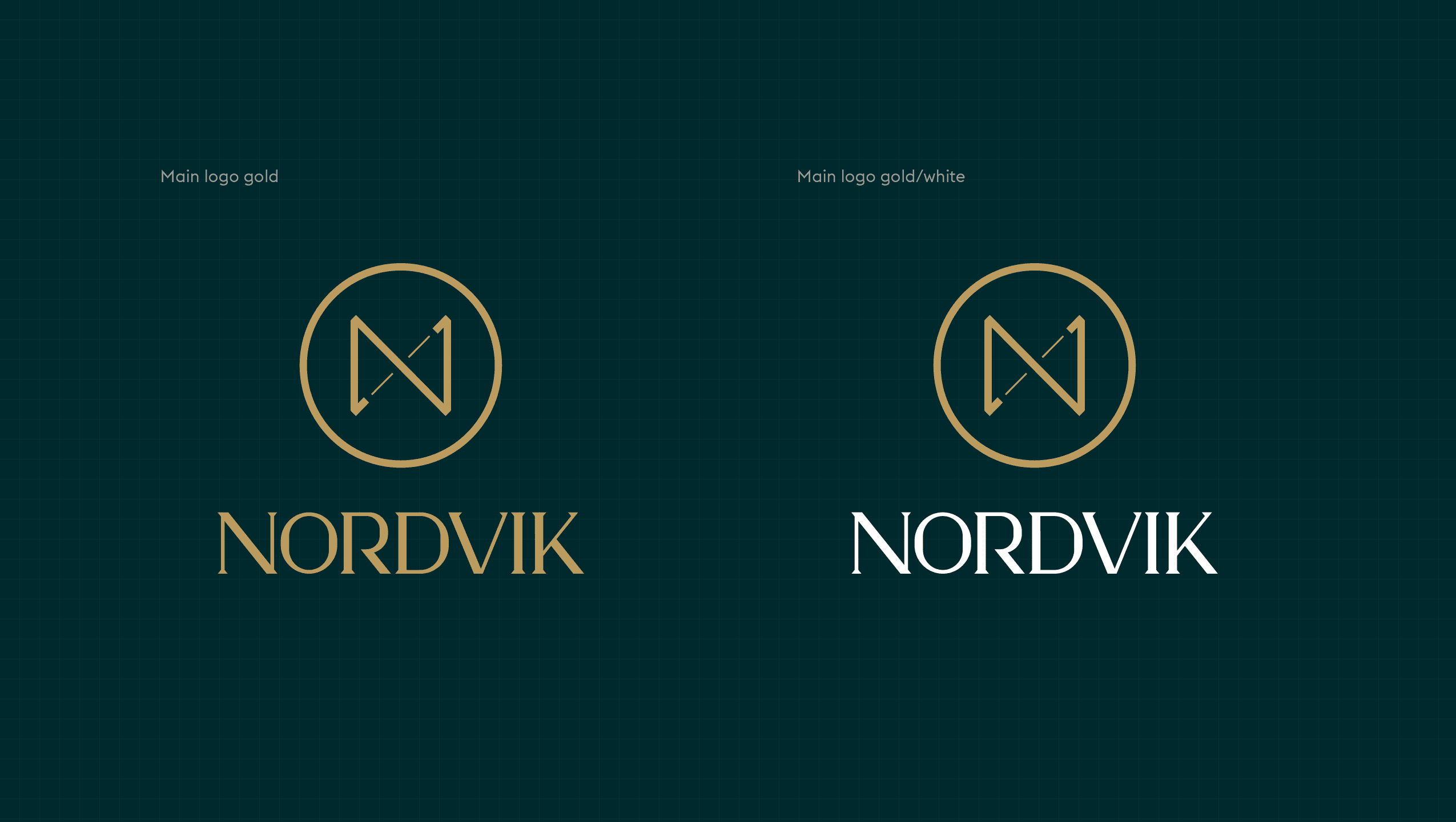
A 3×3 system defines the identity:
The logo
The patterns
The visual language
The symbol places Nordvik in the middle —
connecting buyer and seller.
Deep green and gold introduce contrast —
stability and prestige.
Structure meets position.

Application
One system.
Every surface.
From print and packaging
to motion, campaigns, and environments.
Consistent.
Flexible.
Recognizable.


Solution
A brand system built from a single principle.
Not applied.
Constructed.
Every element is derived from the same structure —
from logo and patterns
to imagery, motion, and application.
A system designed to scale consistently,
while remaining flexible across every touchpoint.


Typography
A dual type system.
Structured.
Refined.
Euclid Flex provides clarity and precision.
Used for interfaces, data, and everyday communication.
Vanitas introduces contrast.
A more expressive voice for headlines and key moments.
Together, they create balance:
Function and feeling.
Structure and character.


Typography & Color
Structure and contrast.
Green grounds.
Gold highlights.
Creating hierarchy —
and directing attention.


Impact
From:
generic → distinctive
traditional → forward-looking
category → position
A brand that signals a different way of operating.

Key Insight
Design didn’t just express the brand.
It helped define its position — and drive its success.